How to Match Light Fixtures with Interior Color Palettes | LUU Lighting
Light fixtures aren’t just sources of illumination — they’re visual statements. One of the most overlooked (yet powerful) aspects of lighting design is how well your fixture’s finish, shape, and color coordinate with the room’s overall color palette.
So, how do you match light fixtures with your interior design without clashing or overdoing it?
At LUU Lighting, we believe lighting should complement your space like jewelry complements an outfit — thoughtful, stylish, and enhancing the whole look.
1. Understand the Role of Color Temperature
Before even thinking about the fixture’s exterior, consider the light it gives off. Light color temperature dramatically affects how colors appear in your room.
• Warm white (2700K–3000K): Enhances earth tones, woods, creams, and warm color schemes
• Cool white (4000K–5000K): Pairs well with greys, whites, blues, and modern minimalist interiors
• Neutral white (3500K): Versatile and ideal for spaces that blend warm and cool colors
💡 LUU Lighting offers fixtures in a range of color temperatures — many are adjustable via smart controls.
2. Match Fixture Finishes with Interior Materials
The finish of your fixture — whether it’s matte black, brushed brass, chrome, or bronze — plays a major role in visual harmony. Here’s a quick pairing guide:
Fixture Finish Best Paired With
Matte Black Monochrome schemes, modern minimalism, industrial design
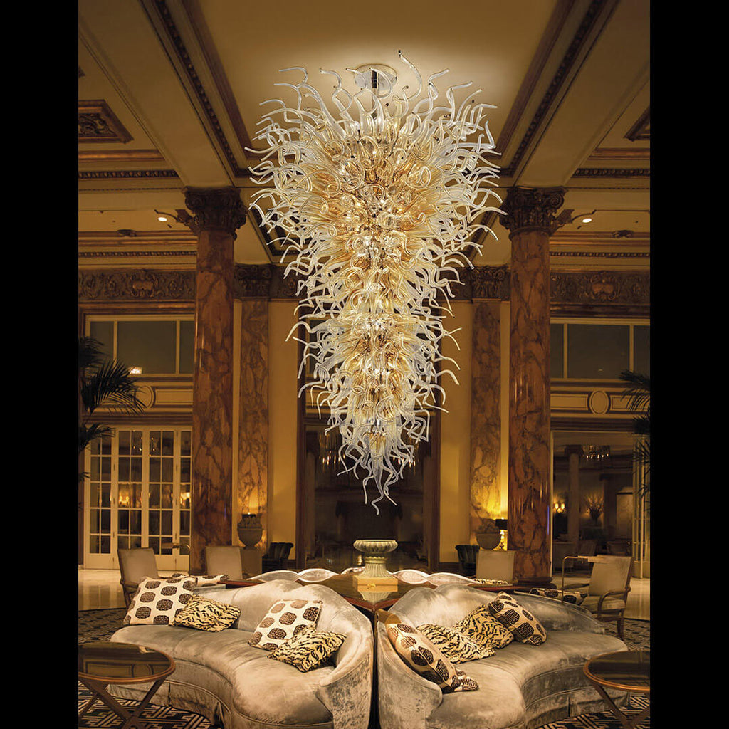
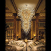
Brushed Brass / Gold Warm woods, cream walls, earth tones, classic luxury
Polished Chrome Cool greys, white marble, glass, ultra-modern interiors
Oil-Rubbed Bronze Rustic palettes, beige walls, wood beams, traditional decor
🛋️ LUU Lighting collections include multiple finishes for the same model — giving you the flexibility to match without compromising style.
3. Use Lighting to Create Contrast or Cohesion
Depending on your design goals, lighting fixtures can either blend in or stand out.
• For seamless cohesion, match fixture color with elements like cabinet handles, table legs, or window frames.
• For high-impact contrast, use lighting as an accent color — e.g., a black pendant in a white kitchen or a gold chandelier in a cool-toned grey space.
🎨 Not sure what works best? LUU Lighting’s design team offers expert advice to help you strike the perfect balance.
4. Pay Attention to Surrounding Textures
Color isn’t just about hue — it’s also about texture.
• Matte finishes feel understated and modern
• Glossy or mirrored surfaces reflect surrounding colors
• Textured metals or glass catch light and create dynamic visuals
For example, a brushed gold sconce on a dark emerald wall gives richness and depth, while a frosted glass pendant on a concrete background adds softness and contrast.
✨ LUU Lighting’s handcrafted textures and finishes are designed to interact beautifully with your walls, floors, and furnishings.
5. Let the Room Speak First
Start with your room’s dominant colors — wall paint, flooring, large furniture. Then ask:
• Do I want my lighting to match or contrast?
• Are my existing tones warm or cool?
• What materials are repeated throughout the space (metal, wood, fabric)?
Then choose a fixture that supports the mood: cozy, elegant, modern, bold, etc.
🛠️ LUU Lighting’s product filters let you browse by style, finish, and color tone — saving you hours of guesswork.
6. Don’t Be Afraid to Mix (If You Know the Rules)
Mixed metals and colors are trending — but they require strategy. Tips:
• Stick to 2–3 complementary finishes max
• Repeat each finish at least twice in the room for cohesion
• Mix warm with warm (e.g., brass with copper), cool with cool (e.g., chrome with black)
🎯 With LUU Lighting’s coordinated collections, you can confidently layer different styles while staying visually unified.
Conclusion: Color-Savvy Lighting = Elevated Design
Your lighting shouldn’t be an afterthought — it should be part of your interior’s story. When you choose fixtures that match (or intentionally contrast) your color palette, the result is a home that feels intentional, elegant, and effortlessly styled.
Shop color-smart lighting at LUU Lighting and explore our curated collections designed to match your home’s every hue.
